Posts

Concluding Thougths

Image
 “Technique is only important insofar as you must master it in order to communicate what you see” My main goal this term was to grow my skill in order to more easily and effectively communicate what I wanted through my artwork. The first part of the term consisted of me figuring out how to better use some of the tools available to me to create art and messing around with more restricted color palettes, as well as working out how to draw people more easily, especially faces. Around the middle of the term, I veered sharply into creating lots of landscapes as well as eliminating linework from the art that I was doing. At the very end of the term these two skillsets kind of came together - my most recent artwork is a landscape that I made with a color palette consisting of 5 shades of blues and greens, and I’m quite happy with how it turned out. At the beginning of the term, I intended to redraw a piece of artwork in order to demonstrate how much I had grown my skills in the ten weeks we’v

Mirror with a Memory

Image
  “Painting was torn between two ambitions: one, primarily aesthetic, namely the expression of spiritual reality wherein the symbol transcended its model; the other, purely psychological, namely the duplication of the world outside.” Of course, being a visual artist, I would look at the part of this reading that applies most closely to what I do. And a lot of what I do is based in reality - I rarely, if ever, do full art pieces without some sort of reference, and my style is relatively realistic and therefore, by nature, grounded in reality. But at the same time, the scenes that I’m depicting are very much fictional and adapted from a source that mirrors reality only on the most basic level. This means that there is plenty of room for artistic design and interpretation, which I think is really fun and has helped me grow my skills a significant amount, but at the same time, there are basically no references truly grounded in reality, as I often find myself referencing other’s art for va

Between Life and Record

Image
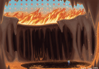
  “When viewing a photo of someone online, that image brings you closer to that person and invites you into their life.” My online presence doesn’t pertain to selfies or really include much of my personal life at all - I make art, usually pertaining to whatever media has recently caught my fancy, and I share that art online, and I talk to people about said media and at, and that’s basically what my online existence is. But some of the principals discussed in the reading aren’t wholly exclusive to what I do. I may not be inviting people into my personal life through the sharing of photographs and selfies, but I am inviting people into specific moments and places - into my interpretation of said moments and places - through my art.  For example, my most recent art depicts a specific moment from a specific person’s point of view, while also working to emphasize a certain tone that wasn’t necessarily fully there in the source material. I wanted to create a contrast between calm stillness a

Grid and Modularity

Image
  “A well-made grid encourages the designer to vary the scale and placement of elements without relying wholly on arbitrary or whimsical judgements.” (Doing this one this week because I’ve realized I’ve done the posts a bit out of order and I haven’t done this one yet) I’ve been doing a significant number of landscape drawings this week, which has been a really fun way to do something different and experiment with a few new techniques. One such technique that I’ve discovered I really quite enjoy is the perspective grid, which is especially useful for planning out more rigid structures. The grid in this case helps me plan out correct proportions and figure out where each element should go in relation to the others. The artwork I used this most for is the one in this post, which has a sort of gothic cathedral-esque design and is therefore relatively modular. Because of this, I did have a bit of trouble getting the proportions right and getting everything to be where I needed it, but it

The Digital vs the Physical

Image
  “As the story goes, the predigital era was the age of reality. Before social media profiles, we were more true to ourselves.” While the reading focused almost solely on selfies and the role that they’ve come to play within society, I’m going to be approaching this line from a slightly different angle. Part of this is out of necessity, as I have no selfies to share and photography is not my main focus in this class. But I do also want to examine this idea from the perspective of someone who, especially in the past few years, has had a significant presence online. I’ve made friends online and I participate in larger social groups online that I would not otherwise be a part of. This of course has had various effects on me. For one, a decent amount of my art skill can be attributed to my online presence. Over the past two years I’ve participated in various communities that center a lot around writing and art. Because of this, I’ve had the inspiration to create art that I otherwise would

Framing

Image
  “A picture frame sets off a work of art from its surroundings, bringing attention to the work and lifting it apart from its setting.” I’m going to be honest, I wasn’t able to finish the main artwork I was working on this week. It did have some interesting framing that was going to be even more emphasized in the final product, but alas, the sketch was fighting me.  The art that I did do this week was more geared towards color palette challenges, in which the artist has a specific, limited number of colors in order to make a piece, usually a simple drawing of a character (though I do want to do it with larger pieces at some point). While framing didn’t exist as purposefully in this setting, that doesn’t mean that it wasn’t at play at all. For one, these aren’t full-page pieces, they are contained within the page, and this fact does mean that they have a sort of margin around them, though not in the traditional sense. Because they are not rectangular images, they don’t have the trad

Nostalgia in a Field of Wildflowers

Image
 "Nostalgia looks toward what once was, not toward what could be. It promotes calm over change and solid stillness over fluid movement." While nostalgia wasn't necessarily at the forefront of my mind while creating art this week, it definitely played a role. We have a field of wildflowers on a sunny day, captured in one happy, peaceful moment. I do think there is a sense of nostalgia to the image itself, regardless of the fact that it never actually took place.    The field is open and calm, the day bright and sunny. Really, it is an ideal place to exist, even if only for a short time. And even if the image itself is fictional, there was also an element of nostalgia in its creation. It evoked a time from my childhood, trekking through a mountain field with my grandmother to document and identify various wildflowers. I even had a notebook that we’d gotten specifically for the purpose, complete with pictures of the flowers that we’d found, compared to a field book for ident